Artwork Setup
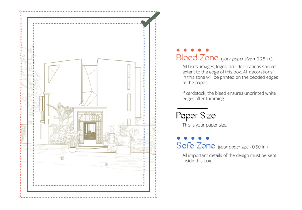
Use the exact paper size for your file, unless opting a full-bleed layout. If a full-bleed design is desired, please extend all design elements 0.25 inches allowance, including the background, to ensure coverage even on the deckle edges and ensure unprinted white edges on cardstock after trimming.
Digital Print
Limitations
We accept black, colored text/illustrations, and designs extending to the paper’s edge. However, due to the unique characteristics of handmade paper, full-page colored/ solid background design prints are not accepted to avoid potential ink bleeding or smudging. We encourage you to explore alternative design options that will highlight the natural beauty of handmade paper while ensuring optimal print quality.
Fonts
The textured nature of handmade papers can compromise the legibility of fine details, particularly small fonts and light-colored, cursive typefaces. A minimum font size of 7pt is recommended, but further adjustments may be necessary based on specific typeface characteristics.
Borders
We cannot guarantee even borders on all sides due to the handmade paper’s rugged and uneven edges
Color Shift
Handmade paper often boasts a distinctive texture that gives prints a matte and slightly muted finish. Compared to white handmade paper, colored handmade paper can make the same ink appear darker due to how light interacts with the different pigments.
Display Differences
Remember, all screens vary in brightness, contrast, and color calibration. So, the vibrant hues you see on your computer screen might not translate exactly to the printed version on handmade paper. Expect a slight shift in tone and intensity.
Format
The print-ready file should be in CMYK color profile. AI, PSD, and PDF format 300 dpi are the preferred file formats.
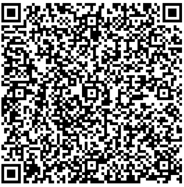
QR Codes
The unique texture of handmade paper can also pose a challenge on QR codes. To ensure your code scans smoothly, choose one with thick and optimal distance between dots and a minimum size of 0.8 inches by 0.8 inches

Letterpress
Design
Simplify your design. Letterpress printing works best with simple and elegant designs that emphasize the contrast between the ink and the paper. You should avoid using too many colors, gradients, or fine details, as they can be difficult to print or may not show up clearly. Instead, focus on using bold, clean typography and illustrations. Give those punctuation marks and fine lines a light stroke to make them a bit heavier on the plate. Remember, your artwork faces up to 40 tons of pressure! Don’t worry, we’ll happily check your artwork to make sure it’s press-ready.
Limitations on handmader paper
Let’s keep things tidy on handmade paper! Since our handmade papers come in pre-cut sizes, full bleed layouts can get a little…inky. So, stick to the safe zone for a clean and happy print. However, full-bleed designs are perfectly achievable on cardstock paper, which allows for trimming to achieve the desired edge-to-edge look.
Mixing intricate details & large fills
Mixing intricate details with large fills is tricky. Achieving adequate ink coverage for large areas can lead to overinking and compromising the quality of fine lines. Consequently, designs featuring both elements may require separate plates and press runs, resulting in increased costs.
Number of colours
The beauty of letterpress comes with a layer of complexity. Printing each color requires its own dedicated plate and press pass. While this creates stunning depth and dimension, it also drives up the cost. With our expertise, we’re limited to two colors maximum per job.
Minimum font size
You should avoid using fonts that are too small, too thin, or too ornate, as they can get lost or fill in with ink. Set your font size no smaller than 8 pt to compensate for ink absorption. However, this may vary depending on the type and line-weight of a font, it’s a good benchmark for determining the font size. Also, ensure enough spacing between letters
Minimum line weights
Lines and dot need to be 1.5 pt or thicker. Anything under this can’t be guaranteed to show up on the letterpress metal plate. Good things to check: dot above “i”, periods, tails of calligraphy.
Big coverage
Large, solid areas in letterpress printing (think bold shapes or full backgrounds) can be tricky in letterpress. Sometimes, the ink distribution isn’t perfectly even, leading to patches or slight variations in tone. The impression into the paper will not be as deep as the indentations of fine lines or text.
Format
Please provide a PDF file that is editable, ideally created in Adobe Illustrator, please keep the layers. Before sending your file, make sure you’ve outlined your type or send to us the typeface used, send us a colored and black version. All images are in vector format.